Tag Archives: ux

Poor design or an attempt at fraud? You decide…

So, I went to Fry’s today to pick up a tax software for this year. I needed one that did both Federal and State.

I picked up the H&R Block Deluxe package and flipped it over to check out the features:

Ahhh… apparently I can get the State version with the Basic edition. Since I don’t need any of the other features offered in the Deluxe edition, I picked up a copy of Basic and flipped it over…

Ummmm….????

So… Basic says the State module is only available in the PREMIUM version?

… Confused….  Bought Turbo Tax even thought it was more expensive.

What lies behind the Red Door?

First, apologies for not updating this space before now. Having a pinched nerve in your arm and keyboarding are not things that go together very well.

To make up for my absence, I decided to finally do the “door post” I’ve been promising since Day 1.

This is the entrance to the location near my home of a nationwide chain of toy stores. I’ve been going to this store for literally years and something has always bothered me about the entrance. In fact, it was this entrance that sparked the idea to create this blog in the first place.
Notice that the entire facade of the store is a bright yellow, practically visible from space. Very friendly and inviting. At the very bottom corner of this mass of yellow there is one red spot.
That “red spot” is actually the ENTRANCE to the store:
The exit is the one highlighted by that massive yellow field….
WHY did they make the entrance to their store the ONLY red on the entire building?
Red is recognized around the globe as meaning “danger”, “stay out”, “warning”. If I’m in a foreign country and don’t speak the language but see a red sign, I know that I should not go past it. Despite this, the owners of this business made the entrance to their business this “DO NOT CROSS” color.
This fact was made very clear to me when I visited the store recently and saw a little old lady standing in front of the store. Clearly, English was not her primarily language. In fact, I doubt if she even spoke it. This little grandma was standing at the YELLOW doors, trying to pry them open. The fact that RED = STAY OUT was so engrained in her that she refused to think that the other set of doors could possibly be the entrance to this store for children. I had to physically take her by the arm and lead her to the red doors.
The entire architectural design of the front of this building is designed to draw your attention to the EXIT. They could very easily change the signs around, move around a few displays and the design would be perfect- a huge yellow expanse calling out to customers and one spot of red warning them of where NOT to go.
 
LESSON LEARNED: Colors matter. They are not just for “artistic beauty”. Ignore them at your peril.

Energy Fiend… Annoying Nav

This post is going to be more of a quick hit, since there isn’t a lot to say about the site in general.

I was having a conversation with my office mate about caffeine content in drinks and she decided to go looking for a source. She found:  www.energyfiend.com/the-caffeine-database

The site has the exact information we were looking for and the information was sortable by name, caffeine level, size, type… all very useful. The blue hyperlinks take you to another screen with an image of the product and ordering information, if available.
HOWEVER… we quickly realized that if you performed a sort, clicked on a hyperlink and then hit the “back” button to return to the main page your sort was dropped, returning you to the default alphabetical listing by product. The expected behavior would have been to retain the sort rather than forcing us to resort and scroll back down to the “M”s to find the caffeine content of Mountain Dew vs Mt Dew Code Red.
As soon as we noticed this behavior my office mate looked at me and said “Something for your blog”… and here it is.
LESSON LEARNED: If a user performs a sort or a search they will expect that to persist during their stay on your site. Don’t make them do the same thing over and over again or they will get fed up and leave.

A look at MSNBC.com

First off, my apologies for again not getting to the “door post”. I promise that one is in the works and I will get the required photos taken this weekend.

In the meantime, let’s take a look at a very popular news site and discuss what works and what could be improved.

As you can tell, the site is MSNBC.com. This site has long been my go-to source for news and it’s usually my homepage. The reporting may tend to be a bit biased at times, but you will have that with every news source since it’s all written by humans with emotions. 
I’ve kept coming to this site because it it well done from a usability perspective. For example:
  • Excellent use of white space, so the user doesn’t feel overwhelmed.
  • Images are well-proportioned to the page and adds to the content rather than distract from it.
  • Sub-navigational elements are well designed and implemented.
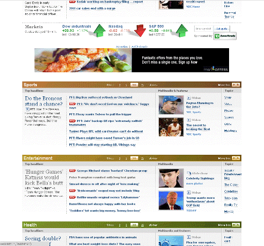
Once the user scrolls down a bit, the page is broken into specific sections for Sports, Entertainment and other popular topics.
Note that each sub-section includes its own images, most of which are links to embedded videos. This can be an effective means of grabbing the eye of somebody who is just doing a quick browse. Often, an image has caught my eye, I’ve stopped to check out the accompanying piece and an excellent use of embedded links to other stories has pulled me deeper into the site. 
Even the subtle things, like the shadow effects on the stock market indicators, add to the overall polished look of the site. Since this is the online arm of NBC, this is to be expected. Unfortunately, not all major media sites look as good as one would expect, but more on that in a future post. 
Room for improvement? Sure. 
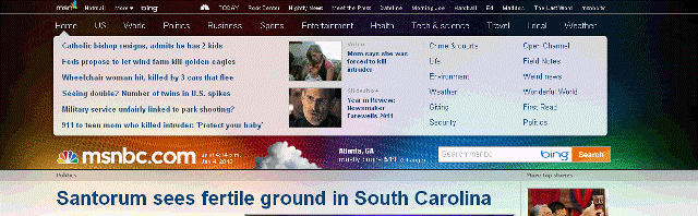
For one, the banner at the top of the home page:
This is actually a clever little design element. If the user mouses over, say “Health”, the floating “speech bubble” displays the most current Health headlines. Therefore, theoretically a person can get a quick recap of all the current news with a simple movement of the mouse. 
So, what’s wrong with it? 
Well, I’ve been coming to this site for a long time and I just noticed that it existed when I was grabbing screen shots for this entry. 
The problem is that is looks too much like an advertising banner at first glance, which is all I was giving it. My clicking pattern was to open the site and immediately scroll down a couple of notches on my mouse wheel until the “ad” was buried at the top so I could see more content. 
What could fix this? Something as simple as moving the “msnbc.com” logo to the top of the page above the bubble. Users are trained to expect that the content of a site begins at that logo and anything above it is something else, typically an ad. 
Overall, MSNBC.com is very well designed but it still has a couple of places where it could be improved. 

Just let me log in!

I know that I said this post would involve a door, but I haven’t had time to go snap the photos for that entry.

Instead, let’s look at how a website can make you go through needless pain for the privilege of sending them money.

Last night, I wanted to order with a national pizza chain. So I went to their website and was presented with their homepage.

There is an “Order Online” button with a big, inviting button. The assumption is that you click the button and would be taken to the log-in screen. Since I have a log-in with them, I click the button. Instead of a log-in screen I get this screen:

Why is the site asking for my location? Shouldn’t I log in and the system would know where my store is?

So, I enter my zip code and am rewarded with this screen:

Now, please note the “Order Online” link… the same link that I clicked two pages ago. Why am I being asked for this yet again? And why is it so small?

Click the link and you get:

FINALLY, an honest-to-goodness log-in screen.

Now I can enter my email and password and start ordering my delicious pizza.

Now, let’s talk about how this should have worked.

When I clicked the “Order Online” button on the home page it should have given me the opportunity to log in. On the order page I would enter the delivery address. The system would then verify that this address is serviced by my stored location. If not, it would advise me that there is a closer location and my pizza would be delivered from that location instead.

LESSON LEARNED: When a user wants to log into your system, don’t make them leap through hoops. Get them into your system first and then take it from there.