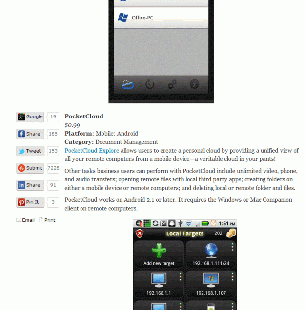
I was researching tools to use for my new business and stumbled on a list of the “Top 25 Small Business Apps” on the PC Magazine site.
I was looking through it and was quickly distracted by the layout of the article.
See below:
The report provides a brief description of the application and a screen shot, all very useful.
However, they have it backwards. The screenshot comes first and then the text. This means that a user has to scroll up (usually past the page break) in order to look at the image to see what the description is referencing. It would have been so much easier if the screen shot was below the text.
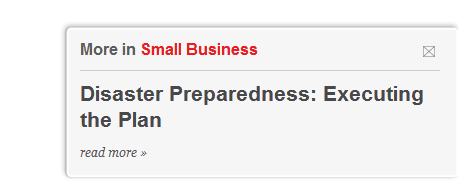
There is also one VERY annoying thing on this site… the new version of the marketing pop-up.
This little box appeared and disappeared every minute or so at the bottom of the screen.
Aren’t we past this intrusive, pushy marketing strategy by now?

